
How to Use Yellow in Interior Design Without Overpowering Your Space
- Kamila Kawai
- Jun 18, 2025
- 3 min read
The Softer Side of Yellow in Interior Design
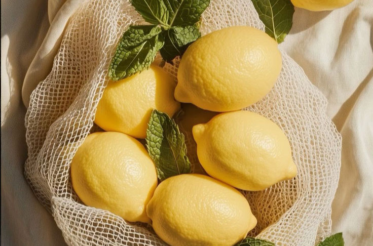
What could represent summer more than a lemon? 🍋
There’s something about yellow that instantly lifts your mood—it brings warmth, energy, and a sense of brightness into any space. But let’s be honest: yellow can be a tricky one to get right.
Used the wrong way, it can feel a bit too much—too primary, too loud, too… cartoonish. But the good news is, yellow doesn’t have to be bold to be beautiful. There are so many softer, more elegant versions that work incredibly well in interiors—buttermilk, ochre, muted mustard, and warm, earthy yellows that feel like a beam of sunlight without shouting.

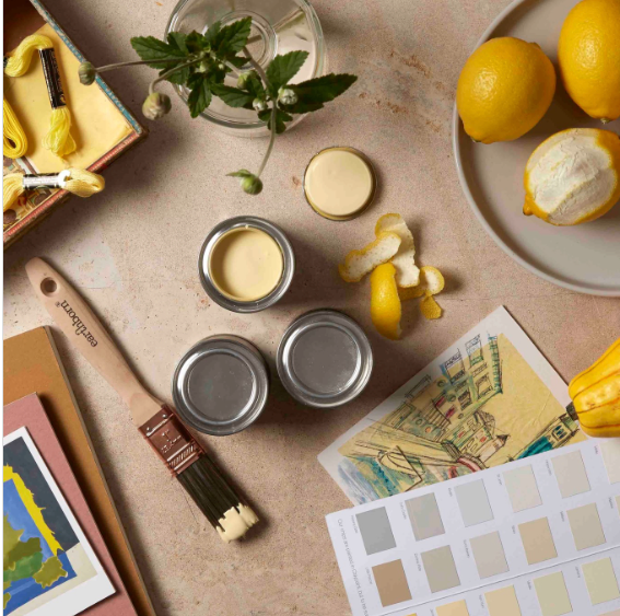
Buttermilk Yellow: Soft, Subtle, and Live
able
One of the most beautiful ways to introduce yellow is through buttermilk tones. They have a creamy, soft warmth that feels welcoming without being demanding. These shades sit somewhere between pale yellow and warm beige—subtle enough to act as a neutral, but with just enough pigment to bring a space to life.
Buttermilk works especially well with:
Soft whites, taupes, and oatmeal tones
Natural textures like rattan, wood, and linen
Earthy accents—think terracotta, olive, or charcoal
It’s perfect for rooms where you want a little glow, without the glare.

Design Inspiration: John Legend’s Mustard Dining Chairs
If you’re looking for a slightly bolder take, take a cue from John Legend and Chrissy Teigen’s home, featured in Architectural Digest and designed by Jake Arnold.
Their dining space features mustard yellow velvet chairs paired with a pale travertine table, soft pink tones in the background, and lots of natural light. It’s rich, saturated, and still incredibly elegant.
This is a great example of how yellow can feel grown-up and refined, even when it’s more vivid. It’s not about using yellow everywhere—it’s about using it intentionally, and letting it shine in the right place. When you combine it with natural materials and a more muted palette, the colour feels grounded, not overpowering.
How to Bring Yellow Into Your Interiors (Without Overdoing It)
Here are some easy, creative ways to add yellow to your space without going full-on sunshine:
1. Upholstery
Try a velvet or linen in buttermilk or mustard for dining chairs, a bench seat, or an armchair. It’s a great way to add both colour and texture without dominating the room.
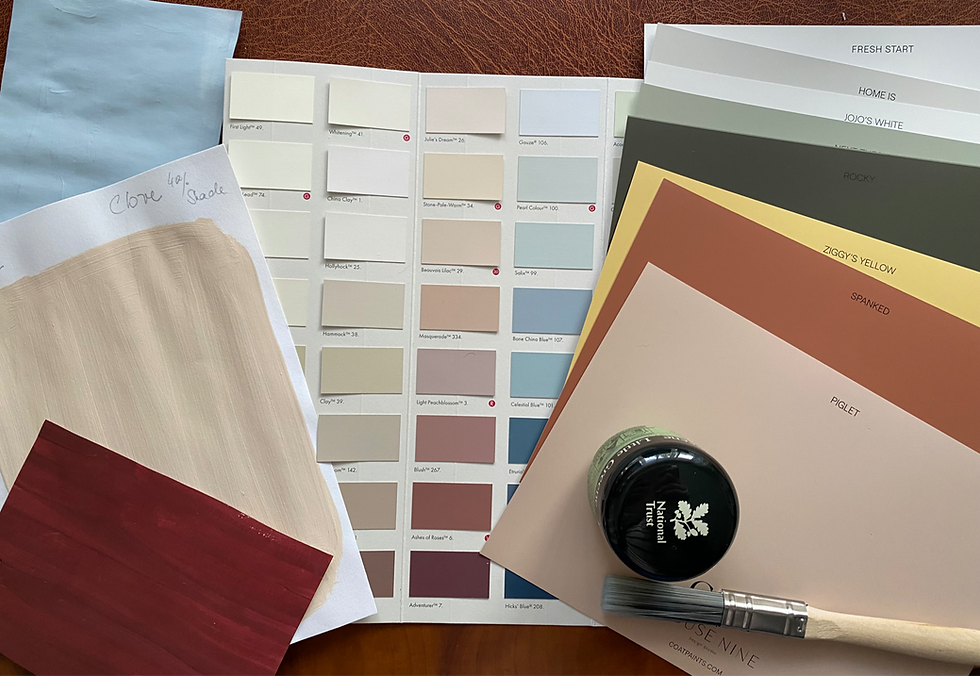
2. Painted Finishes
Cabinet fronts, interior doors, or even a small chest of drawers look beautiful in soft yellow. It’s a bit unexpected, but very liveable—especially when paired with natural tones.
3. Ceramics and Accessories
Yellow glazes have a beautiful glow. Think handmade vases, lamps, or a few statement pieces on open shelving.
4. Art
An abstract print with hints of yellow can lift a neutral room and add visual interest without needing to repaint a single wall.
5. Plants and Decor
A lemon tree in a simple terracotta pot? The ultimate natural accent—and it smells as good as it looks.
Final Thoughts: Yellow That Feels Like You
Yellow doesn’t have to be bold to be beautiful. Whether you go for a soft buttermilk yellow or a deeper mustard velvet, what matters most is how it makes your space feel.For me, colour is all about emotion and atmosphere. I love using yellow to add a touch of joy, a bit of warmth, or a quiet little nod to summer—even in the middle of winter. It's not about following trends, but about finding tones that feel right for you.
So if yellow’s been on your mind, this might be the perfect season to give it a try—softly, slowly, or boldly. Just let it shine in your own way.


Comments